HMI Grid
The Grid allows you to split the available area into a rectangular grid with m rows and n columns. The row and column definitions are build with a list of GridLength nodes. The GridLength node specifies the size (absolute or relative) of the specific row or column.

At the bottom of the Grid node is a pin that allows it to connect several children.
Inputs
Style (Type: Style)
Optional styling of the Grid.
The Grid respects the Width, Height, HorizontalAlignment, VerticalAlignment, Margin and Background styles.
RowDefinitions (Type: List<GridLength>)
A list of definitions that determines the number of rows of the grid, as well as their relative or absolute heights. By default the grid has one row.
ColumnsDefinitions (Type: List<GridLength>)
A list of definitions that determines the number of columns of the grid, as well as their relative or absolute width. By default the grid has one column.
Background (Type: SolidColorBrushByte)
The background of the Grid.
Comments
Children of the Grid have the attached properties Row, Col, as well as RowSpan and ColSpan. These properties define in which grid cell(s) the respective child will be put.
Example
Here is an example that splits the area into two columns and one row, where the left column has 3x size and the right column has 1x size. An image is displayed in the left column and its histogram is displayed in the right column. This definition:
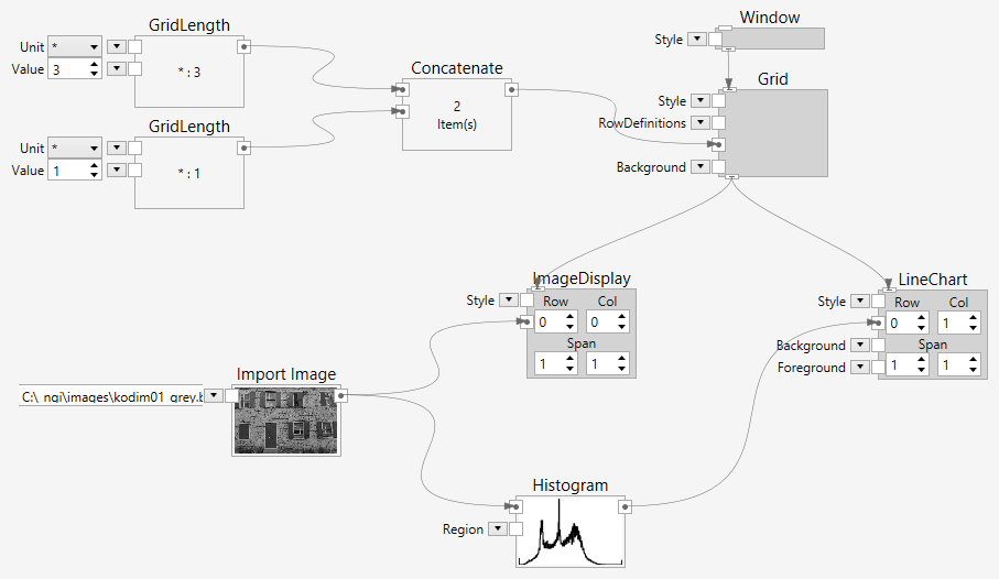
creates the following user interface:
