HMI ComboBox
A ComboBox can be used to select one from a number of entries. It has a collapsed and expanded state.

Inputs
Style (Type: Style)
Optional styling of the ComboBox.
The ComboBox respects the Width, Height, HorizontalAlignment, VerticalAlignment, Margin, Padding, Foreground, Background, Font and Padding styles.
Items (Type: List<string>)
A list of text items that is displayed in the ComboBox.
Index (Type: Int32)
The initial selection of the ComboBox. This is a zero-based index. You can use -1 to specify no selection. This value is used only when the Items pin is connected.
IsEditable (Type: Boolean)
If false, the ComboBox can be used to select items only. If true, you can also type into the edit field of the ComboBox. Typing either selects between one of the items in the list or can be used to enter a text which is not in the list.
Outputs
SelectedItem (Type: string)
The selected item.
SelectedIndex (Type: Int32)
The zero-based index of the selected item, or -1 for no selection.
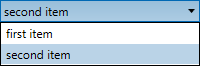
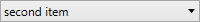
Example
Here is an example that shows a ComboBox. This definition:

creates the following user interface:
and in expanded state: