User Interface Creation
nVision can create and display HMIs (human machine interfaces or custom user interfaces). This facility is used within the nVision Designer at various places, and it can also be exploited by users.
The HMI system is fully integrated in the pipeline programming system. Here is an example of an HMI in nVision:

In the workspace area you see a picture at the left and a dialog area at the right. The picture occupies 3/4th and the dialog occupies 1/4th of the available workspace width. This HMI example is taken from the Exposure tool.
The HMI system is split into imaging centric widgets (used to display images, histograms and other imaging data) and in dialog centric controls (used for standard purposes like entering texts and numbers, making selections, pressing buttons). Both parts are integrated with each other and integrated with the pipeline.
The imaging centric widgets support display of imaging related things, with an additional set of interactive graphical tools. They support layering with arbitrary depth and structure and allow you to create complex displays that may be used for visualization purposes or for editing purposes.
The edge inspector is an example of a tool with a complex graphical widget display.

Controls
The nVision HMI system has a set of controls that can be grouped into layout, input and display purposes.

Window
The root of the HMI is the window.
The Window node creates the connection to the nVision workspace area.

At the bottom of the Window node is a pin that allows it to connect one child to the window. This child can take all the space in the window. Usually, this will be a control from the layout group of controls.
Layout Controls
nVision has layout controls that adapt to the size of the available space (like the StackPanel, DockPanel and Grid), as well as the Canvas, which places controls at specific pixel positions.
In addition, there are the Border, GroupBox and Expander controls, which group child controls (but are no layout controls in the strict sense).
StackPanel
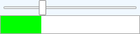
The StackPanel stacks its child controls in the vertical or horizontal direction.
Here is an example that stacks a text label and an edit control vertically. This definition

creates the following úser interface:

DockPanel
The DockPanel docks its child controls to one of the four sides Left, Top, Right or Bottom, where the respective child takes at much space as it needs.
Here is an example that docks a text label to the top and a webbrowser to the left, where the webbrowser fills the available space fully. This definition

creates the following user interface:

Grid
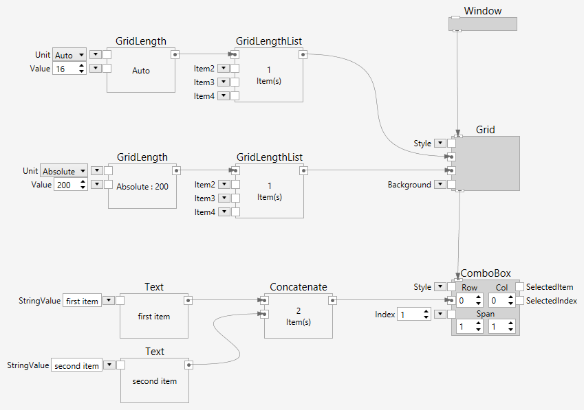
The Grid allows you to split the available area into a rectangular grid with m rows and n columns. The row and column definitions are build with a list of GridLength nodes. The GridLength node specifies the size (absolute or relative) of the specific row or column.
Here is an example that splits the area into two columns and one row, where the left column has 3x size and the right column has 1x size. An image is displayed in the left column and its histogram is displayed in the right column. This definition:

creates the following user interface:

Canvas
The Canvas allows you to put controls at specific positions on the canvas.
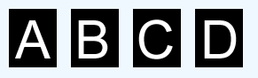
Here is an example that puts four images on a canvas. This definition:

creates the following user interface:
Border
The Border puts a border around its child.
Here is an example that puts a border around an image. This definition:

creates the following user interface:

GroupBox
The GroupBox puts a group box around its child.
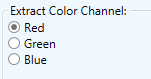
Here is an example that puts a groupbox around three radio buttons. This definition:

creates the following user interface:
Expander
The Expander puts an expandable and collapsibal area around its child.
Here is an example that puts an expander around a profile. This definition:

creates the following user interface:

The profile display can be hidden or shown by clicking the little arrow button at the top-right corner of the expander.
Input Controls
Input controls are used to get input data from a user. This can be a text, a number, or anything else. Various controls are available for this purpose.
Edit
Edit controls provide a means for the user to type data. The HMI system provides edit controls for integer numbers, for floating point numbers, for arbitrary texts and for masked texts (masks provide a means to determined the shape or pattern of of the text that can be entered.
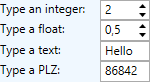
Here is an example that shows the various edit controls. This definition:

creates the following user interface:
Button
Buttons are used to switch or visualize state, as well as to trigger actions. The Button is a push-button, which is released when you no longer push it. The ToggleButton has two states, up or down. The CheckBox also has two states, checked or not, but it visually looks different. The RadioButton is used in groups, where only one of the buttons can be checked.
All buttons have one child, where you can connect an arbitrary complex HMI control hierarchy. All buttons also have a Name input, which you can alternatively use to quickly create normal text buttons.
Button
A Button is down as long as it is held down with the mouse. When it is no longer held down, it releases itself to the up state.
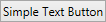
Here is an example that shows a simple text button. This definition:

creates the following user interface:
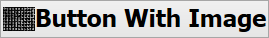
And this more complicated example shows a button with an image and a text. This definition:

creates the following user interface:
ToggleButton
A ToggleButton toggles between the up and down states when it is clicked.
Here is an example that shows a simple toggle button. This definition:
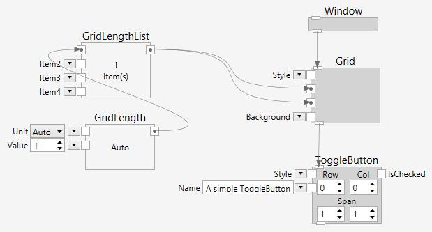
creates the following user interface:
CheckBox
A CheckBox toggles between the checked and unchecked states when it is clicked.
Here is an example that shows a simple CheckBox. This definition:

creates the following user interface:
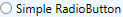
RadioButton
A RadioButton is used in a group with other RadioButtons. Only one of them is checked at a time. If another RadioButton in the same group is checked, the previously checked one is unchecked.
Here is an example that shows a simple RadioButton. This definition:

creates the following user interface:
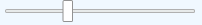
Slider
A Slider can be used to move to or visualize a position.
Here is an example that shows a Slider. This definition:

creates the following user interface:
ScrollBar
A ScrollBar can be used to scroll to or visualize a position.
Here is an example that shows a ScrollBar. This definition:

creates the following user interface:

Listbox
The HMI system has several ways to present lists of strings.
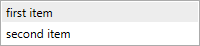
ListBox (Single Select)
A single select ListBox can be used to select one from a number of entries.
Here is an example that shows a ListBox. This definition:

creates the following user interface:
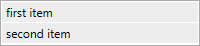
ListBox (Multi Select)
A multi select ListBox can be used to select one from a number of entries.
Here is an example that shows a ListBox. This definition:

creates the following user interface:
ComboBox
A ComboBox can be used to select one from a number of entries. It has a collapsed and expanded state.
Here is an example that shows a ComboBox. This definition:
creates the following user interface:
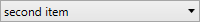
and in expanded state:
Display Controls
Display controls are used to display information for a user. The information can be texts, images, charts or even webpages.
Text
A TextBlock can be used to display text.
Here is an example that shows a TextBlock. This definition:
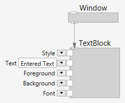
creates the following user interface:

Image
An Image can be used to display an image.
Here is an example that shows an Image. This definition:
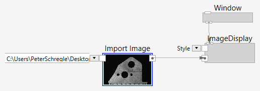
creates the following user interface:

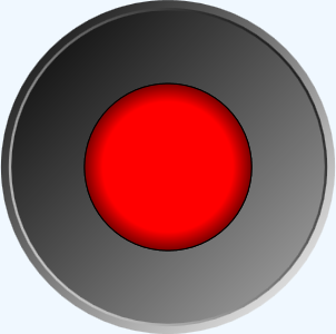
Led
An Led can be used to display a state.
Here is an example that shows an Led. This definition:

creates the following user interface:
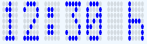
LedSegments
An LedSegments can be used to display text in a segmented led-style display.
Here is an example that shows an LedSegments. This definition:

creates the following user interface:
ProgressBar
A ProgressBar can be used to visualize a value.
Here is an example that shows a ProgressBar, coupled to a Slider. This definition:
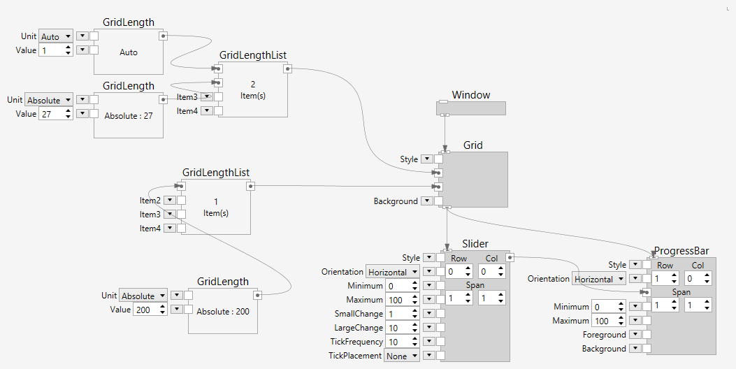
creates the following user interface:
Chart
The HMI system can display various types of charts.
WebBrowser
A WebBrowser can be used to display a webpage.
Here is an example that shows a WebBrowser. This definition:
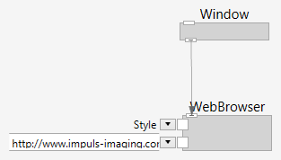
creates the following user interface:

Styling
Widgets
