HMI CheckBox
Buttons are used to switch or visualize state, as well as to trigger actions. The CheckBox has two states, checked or not.

A CheckBox toggles between the checked and unchecked states when it is clicked.
At the bottom of the CheckBox node is a pin that allows it to connect one child.
Inputs
Style (Type: Style)
Optional styling of the CheckBox.
The CheckBox respects the Width, Height, HorizontalAlignment, VerticalAlignment, Margin, Padding, Foreground, Background, Font and Padding styles.
Name (Type: string)
The text that is displayed within the button. This text is only displayed, when no child is connected. If a child is connected, the visual definition of the child is used.
Example
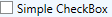
Here is an example that shows a simple CheckBox. This definition:

creates the following user interface: